Capital City: A Display Font That Elevates Digital Branding
It started with a hero section. I was redesigning a boutique online store for a ceramicist—hand-thrown pieces, earthy tones, quiet confidence—and the existing headline font felt like background noise. Too safe. Too generic. So I dropped Capital City into the mockup as a test: “Handcrafted in Portland” at 48px on desktop, 36px on mobile, over a soft-focus studio photo. Instantly, the layout exhaled. Not louder—but *clearer*. More intentional. That’s when I knew this wasn’t just another decorative display font. It was a design decision with weight.
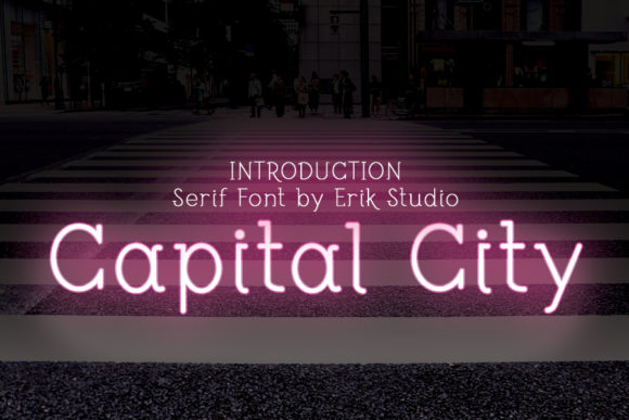
Capital City is a masterfully crafted display typeface—geometric but warm, structured yet expressive. Its letterforms balance clean angles with subtle organic curves: think tapered terminals on uppercase “A” and “R,” a gently flared “S,” and generous x-height that gives it presence without strain. It doesn’t shout; it commands attention through rhythm and proportion. In digital contexts, that translates to strong visual hierarchy, immediate tonal alignment, and a sense of craft that resonates with audiences who value authenticity—like shoppers browsing a small-batch skincare site or readers landing on a thoughtful coaching blog.
I used Capital City across three key areas of the ceramicist’s site: the hero headline, the “New Arrivals” section banner, and the CTA button (“Shop the Collection”). Each use reinforced cohesion—not repetition. On desktop, its tight spacing and confident stroke contrast made headlines scan effortlessly. On mobile, I adjusted tracking slightly (+20) and kept line height generous (1.3), and it held up beautifully—even at 32px on iOS Safari. No blurriness, no awkward kerning traps. Just clarity.
That said, Capital City isn’t meant for paragraphs. It’s a display font, designed for impact—not endurance. I paired it exclusively with Inter, a highly legible, open-source sans serif. Body text, form labels, navigation links—all Inter. Capital City handled only the moments where tone and identity needed to land: section headers (“Glazes & Process”), testimonial pull-quotes (“A vessel that feels like home”), and even the favicon treatment (a simplified “C” monogram). This pairing created breathing room, not competition—a classic principle of effective font pairing in web design.
What surprised me most was how well it worked over imagery. Many display fonts collapse visually when placed atop textured or busy backgrounds. But Capital City’s balanced weight distribution and moderate contrast let it sit cleanly over muted photography—no heavy drop shadows required. I tested it against both light and dark overlays (50% black and 30% white), and at 40–50% opacity, it remained fully legible. That flexibility matters for campaign landing pages, blog banners, or product launch graphics where typography must coexist with visual storytelling.
For other real-world uses, I’ve seen Capital City shine in several contexts:
- A course sales page where the headline “Design With Intention” became the emotional anchor—short, declarative, and unmistakably human.
- A portfolio homepage for a lettering artist, where Capital City introduced their name above a grid of work—elegant, uncluttered, and quietly confident.
- A digital brand kit for a sustainable apparel startup, used sparingly in social media templates and email headers to reinforce premium positioning without sacrificing accessibility.
- A coaching website’s “About” section banner—“Clarity Begins Here”—where its calm authority supported, rather than overshadowed, the founder’s voice.
Readability checks were non-negotiable. I ran quick audits: WCAG contrast ratios (passed AA at 36px+ on light/dark backgrounds), responsive scaling (no clipping or overflow on narrow viewports), and loading performance (the WOFF2 file was under 45KB—fast, even on slower connections). I also verified multilingual support before finalizing: it covers Latin-1, Latin Extended-A, and basic diacritics—enough for English, Spanish, French, and German content common in small business web projects.
Before deploying, I checked licensing. As a commercial font, Capital City includes webfont files, desktop licenses, and clear usage terms—no surprises when embedding in client sites or SaaS dashboards. I appreciated the included stylistic alternates too: a slightly more condensed version for tighter hero lines, and a set of swash capitals for occasional accent use (I reserved those for the “Thank You” page header—subtle, celebratory, never distracting).
One practical note: avoid using Capital City for buttons smaller than 16px or for interface elements requiring rapid scanning (like tab labels or filter chips). Its charm lives in intentionality—not utility. Save it for the moments that shape first impressions: the headline users see in 0.8 seconds, the banner they pause on mid-scroll, the logo lockup that lingers in memory after they’ve closed the tab.
In the end, choosing Capital City wasn’t about trend-chasing. It was about solving a real design problem: how to express craftsmanship, warmth, and quiet confidence in typography—without cliché or compromise. It didn’t make the site “prettier.” It made it *more itself*. And in digital branding, that’s the highest compliment a font can earn.